
Student Financial Portal: Usability Testing
Duration
22nd August 2023 - 30th November 2023
Stakeholders
University of Texas, Austin
Oracle
Team
Tejasvi Shiv
Anagh Mirji
Noel Charlie
Melissa Eisgrau
Li-Yen
Overview
About
The new UT Austin Student Financial Aid Portal revolutionizes student access to financial aid, offering a one-stop solution for managing awards, scholarships, and loans. Integrating internal systems with external platforms, it streamlines processes and automates tasks, significantly enhancing efficiency and user experience in the financial aid journey.
Product Vision
We wanted to transform the Financial Aid Portal into an intuitive, user-centered platform. We aimed to create a seamless, efficient experience that empowers students by simplifying their financial aid journey, ensuring every interaction with the portal is straightforward and effective.
My Role
I spearheaded the heuristic evaluation and competitive analysis, guiding our approach to UX and visual design recommendations. I was instrumental in drafting screeners and meticulously documenting insights from user interviews. My contributions extended significantly across all project phases, ensuring a comprehensive and user-centered design process.
Skills
UX Research
Usability Testing
User Interviews
Affinity Diagram
Quantitative Analysis
Heuristic Evaluation
Competitive Analysis
Tools
Figma
FigJam
Illustrator
KeyNotes
Google Docs
Google Sheets
Context
The University of Texas at Austin, recognizing the limitations of its current CASH (Check Aid Status Here) portal, embarked on a mission to modernize its academic information system. In collaboration with Oracle, they developed the My Financial Aid Portal, aiming to replace the less user-friendly CASH system. This new portal, still awaiting deployment, promises a more intuitive user experience.
Ahead of its student rollout, our team conducted comprehensive usability testing, ensuring the new portal meets the high standards of our university community.
Objectives
1. Uncovering Problems
We aimed to delve into the user experience, pinpointing specific problems users face while navigating the Financial Aid Portal.
2. Discovering Opportunities
A critical part of our study involved closely observing how participants interacted with the portal, noting their behaviors and responses.
3. Learning About Users
Beyond problem identification, our goal was to uncover potential areas for design enhancements, focusing on opportunities that could elevate the overall user experience in future iterations of the portal.
In our quest to elevate the Financial Aid Portal at UT Austin, we embarked on a comprehensive competitive analysis. Our focus was on three direct and three indirect competitors, each offering unique insights into the world of financial aid platforms.
1. Financial aid platforms should be integrated and easily accessible from the main student portal. (like University of Michigan, NC State, and Indiana University)
2. Tool tips and information pop-ups for confusing and complex terms. (like Indiana University)
3. Visualizing financial aid status with graphs and infographics. (like Federal Student Aid)


Takeaways & Insights
Click here to view a clear and in-depth Competitive Analysis.
Heuristic Evaluation
ENHANCING THE USER EXPERIENCE OF FINANCIAL AID PORTAL

The Initial Assessment
Our journey began with a thorough walkthrough of the portal's various flows. Meticulously, we captured screenshots of each screen, creating a visual repository that served as our blueprint for evaluation.
Manual Screening
Initially, we manually dove into the screens, our eyes trained to spot glaring or subtle usability issues. This step was crucial for understanding the user interface and the user experience it fostered.
Jakob Nielson's 10 Heuristics
Beyond problem identification, our goal was to uncover potential areas for design enhancements, focusing on opportunities that could elevate the overall user experience in future iterations of the portal.
Competitive Analysis
A DEEP DIVE IN FINANCIAL AID PORTAL LANDSCAPE
Severity Ratings
A COLOR-CODED APPROACH
Each identified issue was assigned a severity rating and a corresponding color code for easy reference.
This color-coding system simplified the categorization of issues and provided a clear visual hierarchy of the problems that needed attention.

Click here to view an in-depth Heuristic Evaluation.
Usability Testing
UNLOCKING USER INSIGHTS FOR THE FINANCIAL PORTAL AID
Introduction to Usability Testing
Our journey towards refining the Financial Aid Portal at UT Austin took a significant leap forward with the initiation of usability testing. This phase was pivotal in turning our research and heuristic evaluations into actionable insights, ensuring the portal not only met but exceeded user expectations.
Methodology
EMBRACING REMOTE TESTING
The SIX Research Questions
-
Impressions of Website: What are the participant's expectations of what a financial aid portal looks/feels like? Was the platform the participant used in today's test easy to use and pleasurable overall?
-
Content: Could the user gain access to support resources when needed? How well do users understand the disbursement process for their financial aid awards? Is the platform transparent about financial aid terms and conditions?
-
Design/Layout: Do users encounter difficulties with the design of form fields, input validation, or error messages?
-
Navigation: Can users quickly locate specific financial aid resources such as scholarship information or loan details? Are the users able to navigate between different platform sections without confusion?
-
Terminology: Can users gain an understanding of the financial aid process and terms associated?
-
Input: Can the users easily submit the required documents to verify their eligibility for financial aid? How do users experience the verification process, and are there common pain points or questions that arise?
Success Criteria
MEASURING USER TESTING OUTCOMES
Our evaluation of user interactions with the portal was categorized into four distinct outcomes:
Choice of Format
In tune with participant preferences and the digital nature of our times, we opted for remote/online user testing. This approach not only facilitated wider participation but also mirrored the real-world use of the portal.
Research Approach
Utilizing the deductive model of qualitative research, we defined six key categories that transformed into research questions. These questions aimed to delve deep into various aspects of user interaction and perception of the portal.

Success
Marked by minimal effort and no need for external assistance or encountering errors.

Partial Success
Involving moderate effort, minimal hints or errors, and slight confusion or frustration.

Failure
Characterized by considerable effort, multiple attempts, hints, or errors, and significant frustration or confusion.

Skip
Tasks that were skipped due to time constraints.
Participant Screening
CURATING THE RIGHT AUDIENCE FOR USABILITY TESTING
Setting the Stage for Participant Screening
Post the heuristic evaluation, our next critical step in usability testing was to carefully select participants. This phase was vital to ensure that the feedback we received was both relevant and insightful.
Defining Ideal Candidate Characteristics
1. University Affiliation
Actively enrolled as a student at the University of Texas, Austin or are the parent/guardian of a University of Texas, Austin student.
2. Tech Comfort
Regular user of online services, particularly financial aid systems. Comfortable using various internet-connected devices.
3. Feedback Advocates
Open to offering feedback and innovative suggestions.
4. Problem Solvers
Have encountered or are willing to report difficulties/errors.

Screening and Communications
The Selection Process: We meticulously screened each entry against our ideal candidate profile once the responses were in.
Crafting the Messages: Acceptance and rejection messages were composed with thoughtfulness. The acceptance message conveyed excitement and provided the next steps, while the rejection message was crafted to encourage and appreciate the participant's interest.
Click here to view the in-depth Participant Screening document.
In our usability testing, the Test Packet and Moderator Script were instrumental in guiding the experience. The Test Packet, containing task descriptions, scenarios, and success criteria, offered participants a clear roadmap for the session. Before starting, they received a task sheet to familiarize themselves with the objectives and flow of the session.
The Moderator Script was the backbone of the testing sessions, ensuring consistency and effective communication. It included an introduction to set the tone, warm-up questions to ease participants into the session, detailed task briefings, and thoughtful wrap-up questions to delve into their experiences. The script concluded with a post-test questionnaire and appreciative closing words, rounding off the sessions with insightful feedback and gratitude.
Click here for the in-depth Moderator Script, Test Packet, Consent Form, Task Sheet, and Notes.
Crafting the User Testing Experience
MODERATOR SCRIPT AND TEST PACKET
Data Collection
CAPTURING AND ORGANIZING USER INSIGHTS
In our usability testing for the Financial Aid Portal, we emphasized a structured approach to data collection. During each session, we diligently recorded participant behaviors, reactions, and feedback on sticky notes within FigJam. This process allowed us to capture the nuances of each user's experience in real time.
Note Taking


Affinity Diagram
After completing the testing phase, we employed an Affinity Diagram to organize these insights. We categorized the notes under five key areas: Content, Design/Layout, Navigation, Terminology, and Input, corresponding to our initial research questions. This methodical sorting brought clarity and structure, highlighting patterns and key themes across user experiences.
Click here to view the FigJam file.
Task Analysis
UNVEILING USER INSIGHTS AND RECOMMENDATIONS
In the task analysis phase, our approach was meticulous and user-centric. We dove deep into the user experience for each of the nine tasks, revealing valuable insights that guided our design recommendations.
Here are a few crucial task analysis we found:
Research Questions Answered


Results
#1 View and Download the Award Letter
Scenario: Please view and download your award letter for a detailed summary of this academic year's grants, scholarships, and loans

Task User Flow
Research Questions Answered


Results
WHAT ONE OF THE PARTICIPANTS SAID
"I expected 'Review/Accept Awards' to show my award letter, but clicking on it didn't lead me to the download option."
Findings
-
Users didn't first check "Messages" for the Award Letter.
-
Confusion between “Notifications” and “Messages” pages.
-
Many sought the “Review/Accept Awards” button on the “Home” page.
Key Design Recommendations
-
Provide the Award Letter somewhere on the “Financial” page
-
On the “Messages” page, make the whole row clickable, not just the mail icon

#2 Grant Access to Parents
Scenario: Please invite your parent or guardian onto your account to review your financial aid.
Task User Flow

#3 Check When the Financial Aid will be Delivered
Scenario: Find out when the Federal Direct Unsubsidized Loan will be delivered to you for the spring semester.
Task User Flow

WHAT ONE OF THE PARTICIPANTS SAID
"I couldn't find the option to invite my parents and got confused by the website's information. I'd rather just share my login details with them."

Findings
-
Many users forget to click the “Save” icon
-
Users found the page hard to find
-
Users didn’t know to click on “default proxy”
-
Users did not know that “proxy” referred to Guests
Key Design Recommendations
-
Change “Proxy” to “Guest”
-
Make the Save button larger
-
Replace the X icon with a “Cancel” link
Research Questions Answered

Results


WHAT ONE OF THE PARTICIPANTS SAID
"I first checked the home screen, expecting my accepted awards to be there with tasks and key information."
Findings
-
Many users looked for the disbursement date on the “Home” page
-
Every users appreciated the headers on the “Financial” page thought it made navigating the page and finding their desired content much easier
Key Design Recommendations
-
Add semester labels to the disbursement dates.
-
Add the disbursement dates onto the “Home” page.

#4 Exploring Support and FAQs
Scenario: Find the phone number to contact the financial aid office.
Task User Flow


Research Questions Answered
Results


Findings
-
The portal is missing contact and support information
-
Many users had a very similar thought process for looking for this information:
-
Footer -> Home page -> Struggle and look through every page -> Google it
-
Key Design Recommendations
-
Create a footer that includes a Navigation bar and contact information.
-
Create a support and FAQ page that includes contact information and commonly asked questions.
WHAT ONE OF THE PARTICIPANTS SAID
"Ideally, help information is often at the bottom of the page or somewhere convenient like the Home page, where I usually see it."
Quantitative Analysis
MEASURING SUCCESS AND SATISFACTION
After meticulously collecting data during our usability tests, we transitioned to the crucial data analysis phase. This stage was pivotal in transforming our observations into quantifiable insights, providing a clearer picture of the portal's usability.
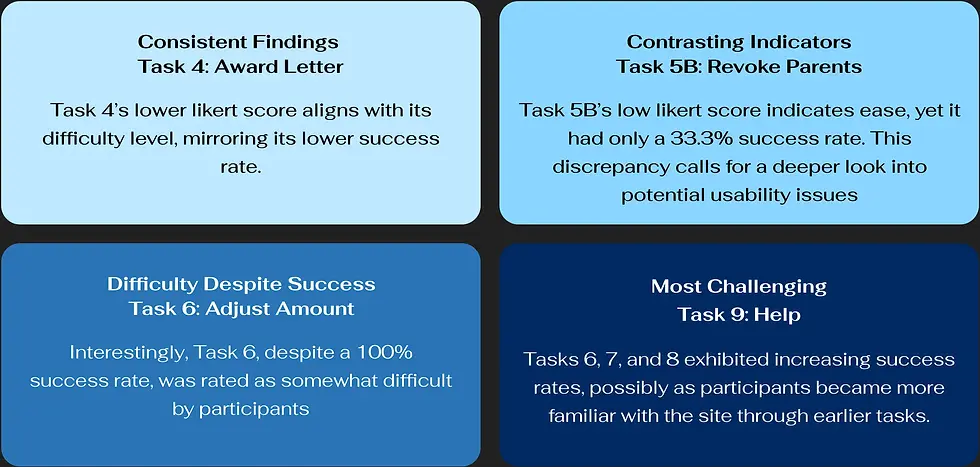
TASK SUCCESS RATE

SUCCESS RATE ANALYSIS


LIKERT SCORE
LIKERT SCORE ANALYSIS
The majority of Likert scores across ten tasks were below 3.0, suggesting a moderate level of difficulty overall.


SUS SCORE
Students with experience using UT CASH gave the platform a high SUS score whereas Participants with experience with more than one portal found My Financial Aid confusing to use
CHALLENGE
How might we enhance the Financial Aid Portal's design and functionality to ensure an intuitive, efficient, and user-friendly experience for all students?
Key Takeaways
MY LEARNINGS FROM USABILITY TESTING
1. Don't Assume
Do not assume that users are familiar the interface when giving tasks and asking for feedback
2. Don't just listen, observe
Even though we asked participants to think out aloud, we got several insights from what they did (mouse movements, navigation, pauses)
3. Users believe they are at fault when they make a mistake
Do not assume that users are familiar the interface when giving tasks and asking for feedback
4. Prior knowledge of financial aid is useful
Even though we asked participants to think out aloud, we got several insights from what they did (mouse movements, navigation, pauses)
Thank You!
